layouts
i have been wanting to add something to my site that people could potentially walk away with, so i decided to make some basic/simple layouts for you to snag if you like! my goal is to have easy-to-change-and-mold layouts that are simple to edit and understand on the inside. the code for these is ten times neater than that of my own website. i would appreciate credit or some link back, but it is not a requirement if you ctrl+c these for your pages ^-^ i coded this by hand, with html and css resources in other tabs as i worked, so truly the credit goes to w3schools lol. click the images for live previews!

layout #1 version 1
first of all, i implore you to change the colors lmao. i am bad at color schemes; my goal was a magical pink/purple/yellow vibe but i don't know if i acheived that haha. for this layout, i wanted a side nav with blocky links, and a wide main column.
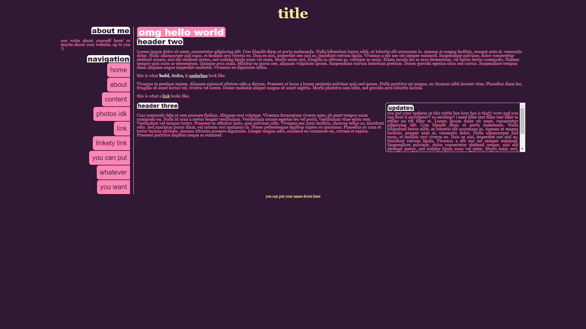
html:
css:

layout #1 version 2
then i decided another version with a top nav would be cute, with a huuuge main content area.
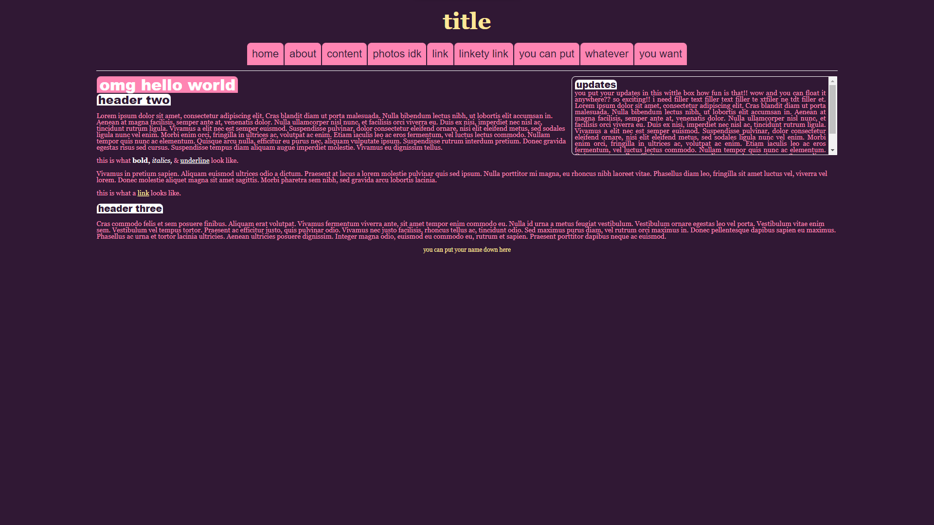
html:
css:

layout #1 version 3
& THEN i was like, maybe a second column would be nice lol.
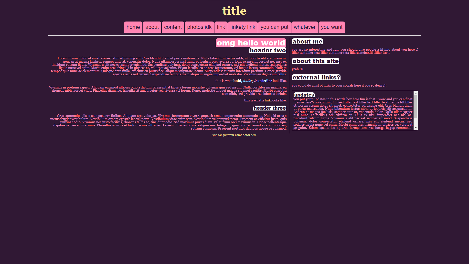
html:
css:

layout #2 version 1
ok for these i wanted something bubbly and cute!
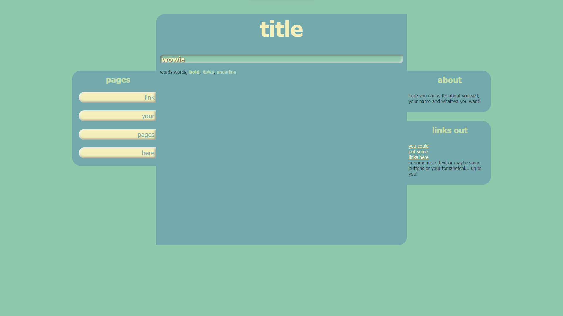
html:
css:

layout #2 version 2
here's the second version with a top nav :)
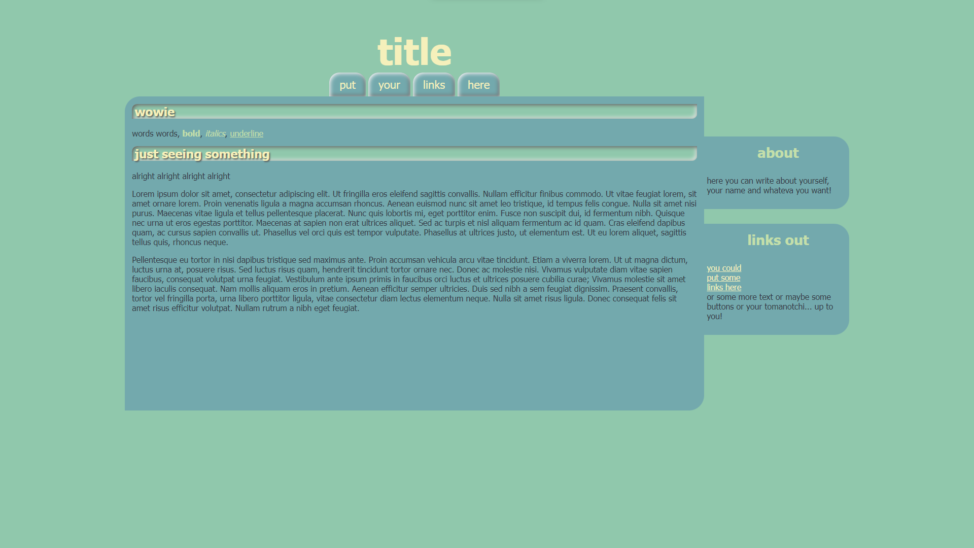
html:
css:
